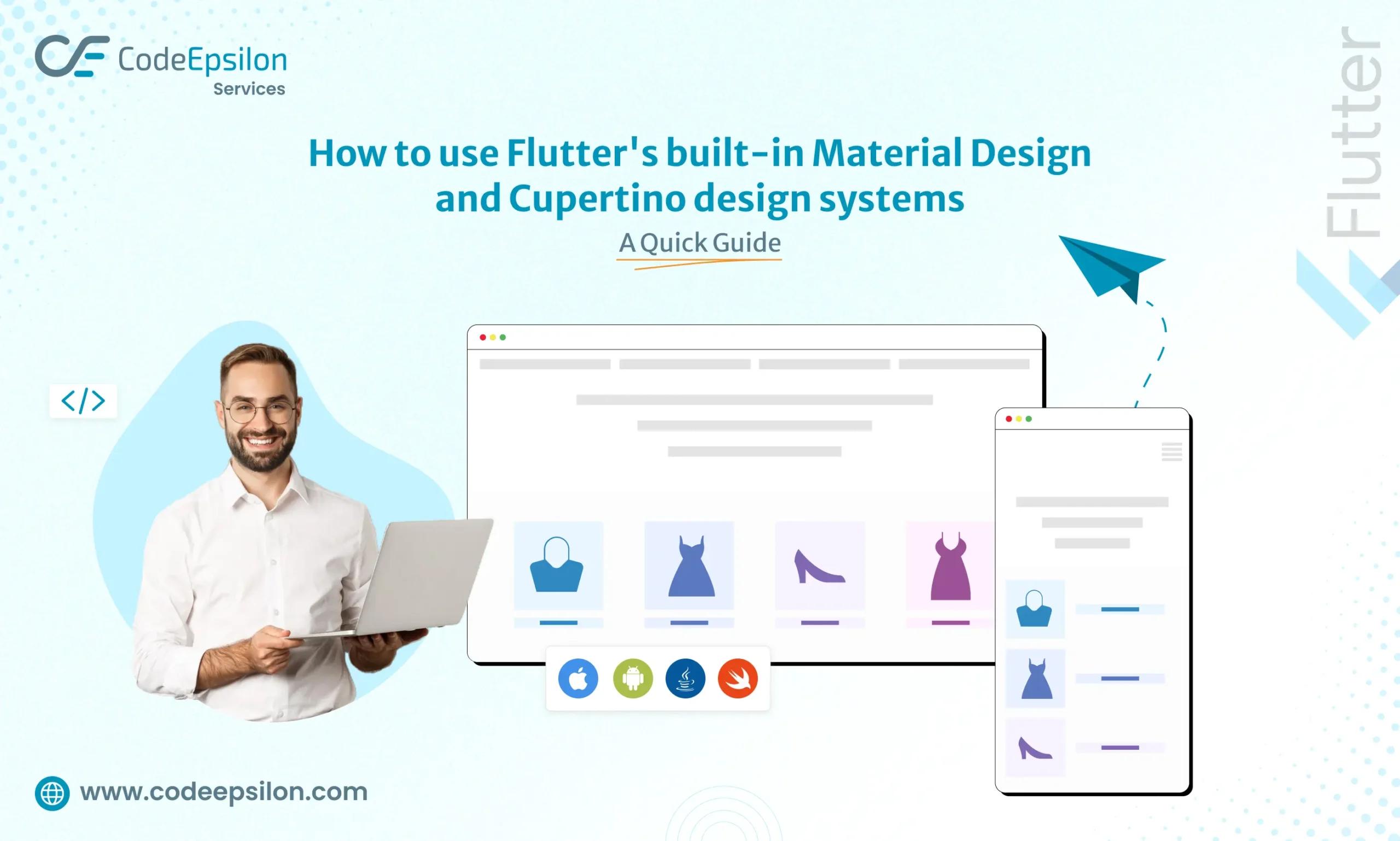
How to use Flutter’s built-in Material Design and Cupertino design systems: A Quick Guide
Like it
Share it
15 Jul
4 min
969
363
In app development, creating a visually appealing and user-friendly interface is paramount. Apps should look nice, be easy to use, and work smoothly for users. Flutter, Google’s open-source UI framework, equips developers with two robust design systems: Material Design and Cupertino. These design systems streamline the process of crafting stunning user interfaces that adhere to platform-specific guidelines. This article explores how to utilize Flutter’s built-in Material Design and Cupertino design systems, underscoring their significance in Flutter app development.
Brief of Design Systems
Design systems are essential for consistent and aesthetically pleasing user interfaces. They provide a set of predefined elements, guidelines, and principles that help maintain visual harmony and improve user experience. Flutter takes advantage of two well-established design systems: Material Design (for Android) and Cupertino (for IOS).
Material Design
Material Design, developed by Google, offers comprehensive guidelines and components for creating visually pleasing and intuitive user interfaces. It is known for using shadows, bold colors, and responsive animations. Material Design fosters a unified look and feel across Android devices and web applications.
Cupertino
Cupertino, on the other hand, is Apple’s design system inspired by Apple’s Human Interface Guidelines. It embraces a clean and minimalist design philosophy focusing on simplicity and clarity. Cupertino design components are intended to provide a native iOS look and feel to Flutter apps.
Leverage Material Design in Flutter
Import Material Package
In your `pubspec.yaml` file, ensure that you have the `material` package imported:
Build Using Material Components
Flutter provides a rich series of Material Design widgets that you can use to build your app’s UI. These include buttons, cards, navigation drawers, and more. For instance, to create a Material button, you can use the `ElevatedButton` widget:
Define Material Theme
To maintain design consistency throughout your app, define a Material Theme. You can configure aspects like colors, typography, and shapes in the theme to match your app’s branding:
Use Cupertino Widgets
Flutter’s Cupertino package offers widgets that mimic the design and behavior of iOS elements. For instance, to create a Cupertino-style button, use the `CupertinoButton` widget:
Configure Cupertino Theme
Configure a Cupertino theme to maintain a consistent Cupertino design across your app. This theme enables you to customize colors and styles to match your app’s iOS aesthetic:
Real-world Flutter apps with Material Design and Cupertino design systems
Google Ads
Google Ads is a prime example of an app that utilizes Material Design. It incorporates Material Design’s bold colors, motion, and typography principles to create an aesthetically pleasing and user-friendly interface.
Apple Music (Android Version)
Apple Music on Android showcases the Cupertino design system within a Flutter app. Adhering to Cupertino guidelines provides Android users with a familiar and consistent iOS-like experience.
Flutter Gallery
The official Flutter Gallery app is a fantastic showcase of Material Design and Cupertino design systems. It demonstrates how Flutter widgets from both design systems can be used effectively within a single app.
Conclusion
Flutter’s built-in Material Design and Cupertino design systems offer developers a powerful toolkit for crafting visually stunning and platform-consistent user interfaces. Whether you’re targeting Android, iOS, or both, Flutter’s flexibility and adherence to these design systems make it easier than ever to create apps that are not only visually appealing but also intuitive and user-friendly.
As the demand for cross-platform app development continues to grow, Flutter’s support for these design systems positions it as a leading choice for developers looking to build apps with a polished and professional appearance. If you’re looking to bring your app ideas to life, consider hiring a Flutter app developer to leverage the full potential of these design systems and create exceptional mobile experiences.
As businesses strive to stay competitive, technical project managers must efficiently manage their projects, timelines, and resources. As technology advances at an unprecedented pace, integrating artificial intelligence (AI) into various domains reshapes how tasks are accomplished. In project management, AI is proving to be a transformative force, augmenting the role of technical project managers, and...
Imagine the situation, a few weeks ago you download an application that delivers all your grocery needs without leaving your house. You used it many times and everything was running great. They have delivered you several orders successfully. Now one fine day you want to order groceries, so you access the app for that. You...
 Email
Email India
India USA
USA Email
Email


